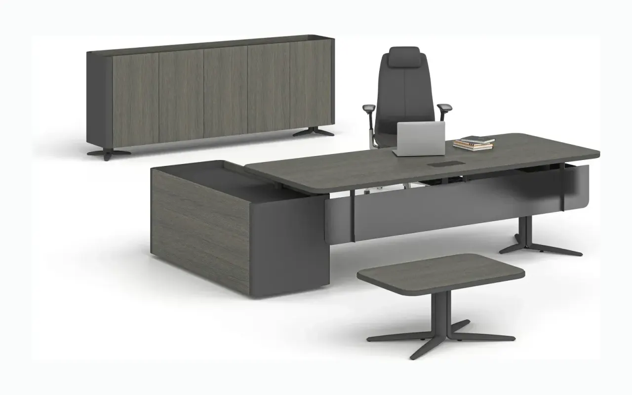

How to Achieve Office Color Harmony?

Office design is not just about desks, chairs, and cabinets — colors are among the most important elements that directly influence the spirit and productivity of a space. Color harmony determines both employee motivation and the first impression left on visiting clients. The right color combinations make your office not only stylish but also functional, comfortable, and aligned with your brand identity.
In this article, we provide a comprehensive answer to the question of how to achieve color harmony in offices, covering everything from color psychology and lighting effects to wall-furniture coordination and corporate identity reflection.
Color Psychology: The Effect of Colors on People
Colors are not merely visual elements — they are also psychological tools. It has been scientifically proven that the colors used in an office directly affect employees' mood and performance. For this reason, color selection is not just an aesthetic choice but a functional one.
- Blue: Conveys calm, focus, and a sense of trust. Frequently preferred in finance, law, and IT offices.
- Green: Creates a sense of nature, balance, and freshness. Suitable for creative work or healthcare environments.
- Yellow: Adds energy, attention, and positivity. Can be used in marketing, advertising, and startup offices.
- Red: Creates a strong emphasis and an eye-catching detail, but can become tiring when overused.
- Grey and White: Provides a neutral, corporate, and sophisticated atmosphere. Ideal as a base tone in modern offices.
How to Achieve Color Harmony Between Wall Colors and Furniture
When establishing color harmony, a visual balance must be created between the office walls and the furniture. The wall color forms the fundamental backdrop of the space and determines furniture selection.
Recommended pairings:
- Light grey walls + dark wood desk sets → Modern and professional appearance.
- Beige or cream walls + white furniture → Bright and understated office atmosphere.
- Navy blue wall panel + light oak desk → Elegance and contrast harmony.
Contrasting colors draw attention, while similar tones calm the space. When choosing colors, the aim should be to avoid visual strain while achieving a cohesive overall look.
Color Preferences Based on the Office's Light Intake
Natural and artificial light significantly affect color perception. The same color tone can look completely different under varying lighting conditions. Therefore, the office's lighting situation must be considered when selecting colors.
- In offices with natural daylight: Darker tones can be preferred; the space will not feel dim.
- In offices with limited light: Light colors (white, light grey, pastel tones) make the space feel more open and airy.
In offices with artificial lighting, the color of the light itself (cool white, daylight, warm yellow) also affects color harmony. For example, warm tones stand out under yellow light, while bluish tones appear more vivid under cool white light.
Using Colors to Reflect Brand Identity
Integrating corporate identity into office design presents visitors with a strong brand image. Logo colors can be reflected in the office as dominant wall or accessory colors. This approach is especially important for offices that receive clients.
Example: A company with an orange and black logo can achieve a professional harmony in its office with orange seating groups, black desk details, and white walls.
Corporate colors can be used on furniture, boards, filing systems, carpets, and even in details such as waste bins.
Color Strategy Based on Office Size
The square footage of the office also matters in color selection. Light colors are more appropriate for small offices, while darker and warmer tones suit larger spaces. In offices with high ceilings, dark colors balance the space, while in low-ceilinged areas, light colors make the ceiling appear higher.
- For small offices: Light beige, ivory, and white tones + a few dark accents.
- For large offices: Bold tones such as grey, navy blue, black, and anthracite + a light-colored floor.
Regional Color Usage Strategy
Rather than using a single uniform color throughout, using different colors in different office areas helps employees make mental transitions. For example:
- Open office area: White, light grey — Promotes focus and a neutral environment.
- Meeting room: Dark blue, anthracite — Enhances seriousness and concentration.
- Social area / break zone: Green, pastel yellow — Creates relaxation and warmth.
Achieving Color Balance with Office Accessories
It is possible to achieve color harmony in the office not only through walls and furniture but also through small details. Desk accessories, boards, waste bins, and file holders — as supporting elements — should also be consistent with the overall color theme.
Suggestion: A grey desk, white walls, yellow file holders, and a grey chair can produce a modern, balanced, and energetic look.
Common Color Harmony Mistakes
Just as important as achieving the right color harmony is avoiding common pitfalls:
- Excessive use of vivid colors: Dominant use of colors such as red and orange is visually tiring.
- All furniture in the same tone: Creates monotony in the space and reduces the sense of depth.
- Dark color combinations in dim lighting: The space appears smaller and more enclosed than it actually is.
- Overuse of corporate colors: Brand colors should be emphasized, but the space should also be allowed to breathe.
Trending Office Color Combinations
Some of the modern office color combinations that stand out in 2025 include:
- Grey + Light Wood + Black → Modern, corporate, and clean.
- Beige + Green + White → Natural, calm, and serene.
- Navy Blue + Yellow + Anthracite → Eye-catching, modern, and youthful.
- Matte Black + Gold Detail + Cream → Luxurious and prestigious atmosphere.
Creating a Powerful Office Environment with Colors
The color harmony of your office is not merely a visual element — it is a strategic choice that affects employee productivity and brand image. An office designed with the right colors both motivates employees and reflects your corporate reputation. Taking into account many factors — from color psychology and room dimensions to lighting effects and accessory details — will result in a professional and inspiring workspace.
Remember, your office's color is also your brand's voice. Give direction to your design through color to deliver that voice in the right tones.
Looking for the right furniture for your office?
Browse the full catalogue and add your favourites to your quote list.
Explore Products