
Color Psychology and Office Furniture: How Do Colors Affect Employee Productivity?

Color psychology and office furniture selection directly determine how productive a workspace feels. The fabric tone of a chair, the laminate color of a desk, and the paint on the wall are all visual stimuli that affect an employee's focus, calmness, and energy throughout the day. At Fil Office, when we produce and plan office furniture, we treat color not merely as an aesthetic preference, but as a tool that must be designed in conjunction with the function of the space. In this article, we explain — with concrete examples — the psychological impact of blue, green, gray, and wood tones on work psychology; the color difference between an executive office and an open-plan office; and how to translate brand colors into a physical workspace.
Why Do Color Psychology and Office Furniture Affect Productivity?
The eye interprets colors within the first seconds of entering a space, and the brain reacts physiologically. Cool tones calm the pulse and attention, while warm and saturated tones raise the level of arousal. For teams sharing the same space all day in an office, this is not a momentary impression — it is a continuous effect.
Office furniture occupies the largest surface area in this equation. The top of a workstation, the tone of the chair fabric, and the color of cabinet doors remain far closer and for far longer at eye level than a wall. That is why limiting the color decision to wall paint alone means missing a large part of the overall effect.
The right color balance delays fatigue, while the wrong balance leads to distraction in the middle of the day. The goal is to achieve a visual warmth level appropriate to the function of the space: calming where concentration is needed, energizing where interaction is needed.
The Psychological Effect of Blue, Green, Gray, and Wood Tones in the Workplace
Each color family has a distinct role in an office. The distinctions below help clarify furniture and wall decisions by area.
- Blue: The concentration and calm tone. It works as a wall or acoustic panel color in departments such as software, finance, and law that require prolonged focus. Choosing a gray-tinted blue rather than a saturated one reduces eye strain.
- Green: The balance and rest tone. The eye distinguishes green with the least effort; this makes it the least tiring color on long days spent in front of a screen. Ideal for break areas, cafeterias, and transition corridors. Its effect is amplified when used alongside plants.
- Gray: The neutral base color. Anthracite and light gray tones form the safest foundational palette for office furniture; they are compatible with any brand color and give a corporate look. Too much gray on its own, however, makes a space feel cold and monotonous — it must always be balanced with a warm or accent color.
- Wood tones: The warmth and trust tone. Oak, walnut, and natural laminates give a space a homely comfort and a sense of rootedness. For executive and conference tables, wood is the most effective choice for conveying authority and warmth simultaneously.
The 60-30-10 Rule: Balancing Furniture and Wall Colors
To avoid leaving color decisions to intuition, the 60-30-10 ratio widely used in interior design provides a practical framework. Approximately 60% of the space is planned in a dominant neutral tone (usually walls and large cabinet surfaces), 30% in a secondary tone (furniture frames, desk tops), and 10% in an accent color (chair fabric, acoustic panel, accessories).
This ratio ensures the space appears neither monotonous nor chaotic. For example, light gray walls (60%), wood-topped workstations (30%), and mesh chairs in the brand color (10%) create a balance that is both calm and lively.
Placing the accent color on easily replaceable pieces rather than large, fixed surfaces is a smart investment. Chair fabric, ottomans, and side tables can be refreshed over the years; repainting walls or built-in cabinets is far more costly and laborious.
Executive Office vs. Open-Plan Office: The Same Color Strategy Won't Work
The function of a space determines its color palette. Applying the same logic to an executive office and an open-plan office works against the purpose of both spaces.
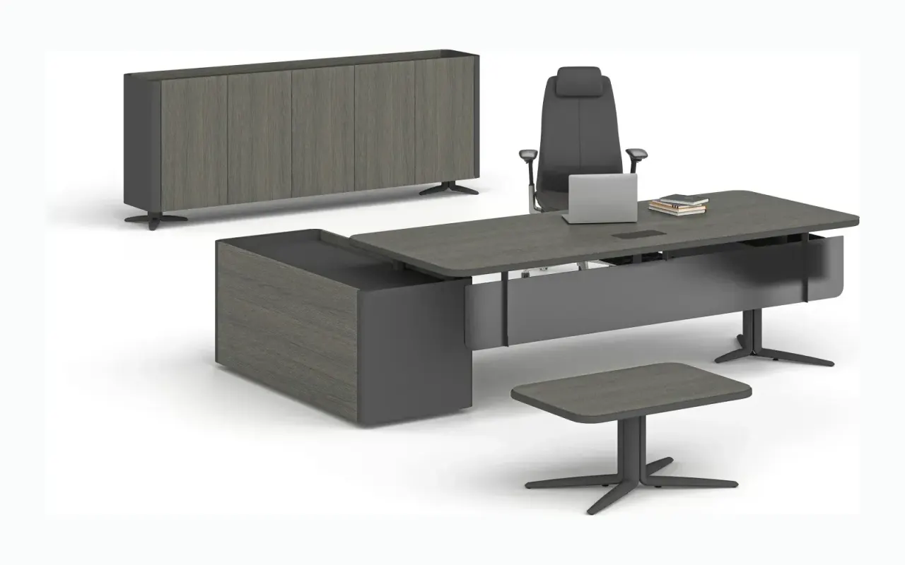
The goal in an executive office is to convey trust, authority, and warmth. A dark wood-toned executive desk, a deep anthracite or navy chair, and neutral walls combine seriousness with hospitality. Here, the number of colors is kept low, and material quality takes center stage.
In an open-plan office, the goal is to keep energy alive and to divide the large area into zones. A uniform sea of gray quickly tires employees. Colored acoustic panels, seating groups in the brand color, and green break islands provide visual openness while also intuitively communicating what each area is for.
In meeting areas, a middle ground is needed — one that does not break concentration but does not create drowsiness either: neutral walls, a wood conference table, and a single energizing accent color are typically the most productive combination.
The Right Way to Bring Brand Color into the Office
Reflecting corporate identity in a space creates a strong sense of belonging, but spreading the brand color across every surface often backfires. A highly saturated corporate color, carried to all walls, can make a space feel tiring and oppressive.
A more sustainable method is to use the brand color in the accent layer: one face of the reception counter, waiting area chairs, acoustic panels, or an accent wall in a meeting room. In this way, the identity is clearly readable while the working areas remain neutral and restful.
Establishing the brand's official color code (HEX or Pantone) from the outset and matching furniture fabric and laminate selections accordingly prevents tone mismatches that arise with piecemeal purchases. In Fil Office corporate projects, we plan this matching at the design stage, so consistency is maintained from the reception area to the conference room.
Practical Factors Affecting Color Choice
Color is never evaluated in isolation; light, space size, and intensity of use all change the final effect.
Reviewing the following points before making a decision minimizes the surprises between a screen image and the real space.
- Amount of natural light: In areas with few windows, dark tones make the space feel smaller; light neutrals and reflective surfaces are preferred in these areas.
- Artificial lighting temperature: Wood tones can look washed out under cool white light; lighting color and furniture tone should be selected together.
- Space scale: Light tones open up small offices, while dark tones make large, high-ceiling spaces feel more intimate.
- Soiling and wear: For heavily used chairs and sofas, mid-tone, stain-concealing fabrics are more practical in the long run.
- Viewing fabric and laminate samples on-site: The color decision must always be made in the actual lighting of the space, using a physical sample.
Color Recommendations by Area
Coloring each zone according to its function produces more productive results than imposing a single palette on the entire office. The following starter recommendations work in most corporate offices.
- Executive and private offices: Dark wood desk, anthracite or navy leather chair, neutral wall; balance of authority and warmth.
- Open-plan workspaces: Light gray flooring, wood-topped desks, mesh chairs in the brand color; openness and energy.
- Meeting rooms: Neutral wall, wood conference table, one energizing accent; focus and vitality.
- Waiting areas and reception: The most visible use of the brand color; a warm and welcoming palette.
- Break areas and cafeteria: Green and wood-dominant tones; restful, easy on the eyes.
Frequently Asked Questions
Which color most increases focus in an office?
In areas requiring prolonged concentration, blue tones stand out; their calming effect helps gather attention. Choosing a slightly gray-tinted blue rather than a saturated one reduces eye strain. For intense days spent in front of screens, green is the least tiring color for the eyes and is ideal for break and transition areas.
Is painting the whole office in the brand color a good idea?
Generally, no. Spreading a saturated brand color across all surfaces makes a space feel tiring. Using the brand color in the accent layer — such as reception, waiting chairs, or acoustic panels — while keeping workspaces neutral, both clearly shows the identity and preserves productivity.
Does gray office furniture look boring?
Gray can feel cold and monotonous when used alone, but when used correctly, it is the safest corporate base. When you balance anthracite or light gray furniture with wood tones and an accent color, the space looks both serious and lively.
Can I use the same colors in the executive office and the open-plan office?
Not recommended. The executive office calls for a palette heavy in dark wood and neutrals, with few colors, for authority and warmth. The open-plan office requires more vivid accents and colorful acoustic solutions to maintain energy and delineate zones. The two spaces serve different functions.
Related Products and Pages
Looking for the right furniture for your office?
Browse the full catalogue and add your favourites to your quote list.
Explore Products